Skip to content Skip to sidebar Skip to footer

Portfolio Jevie Skin

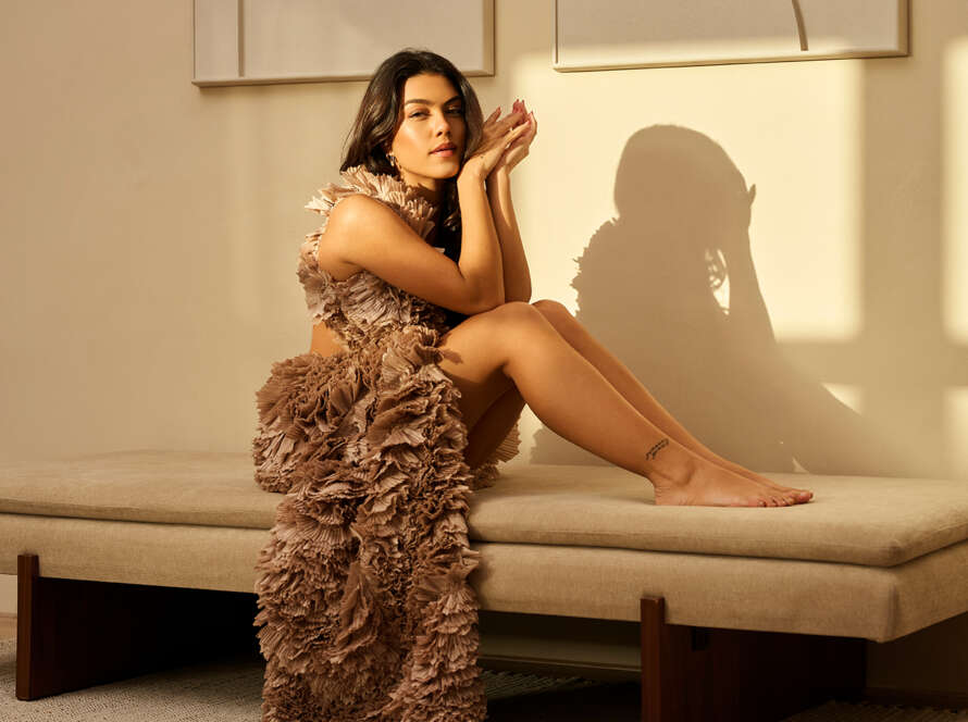
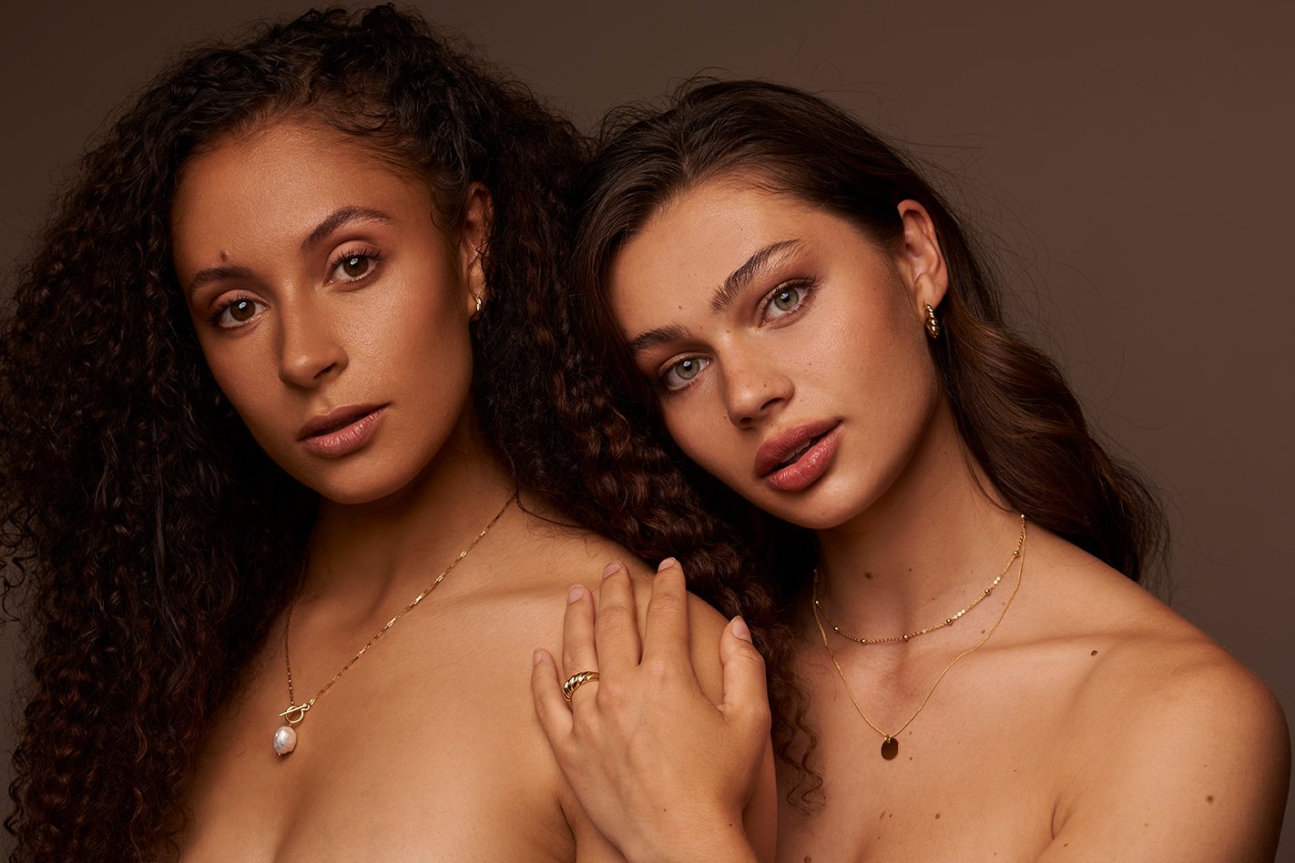
In this series, We will take you along a shoot we did, talking about the concept we had for the shoot and the final results. What the intention was for the shoot and why, in this post I will take you along the creative images if shot for Jevie Skin.

Something I wanted to do for a while, Is sharing my work from previous shoots. As I really like to keep my portfolio up to date, some images got taken down on our website. So to keep them in memory, I really enjoy sharing them here with their story.

2024

What was the concept?

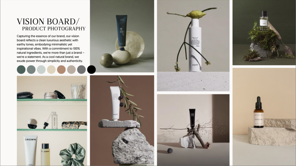
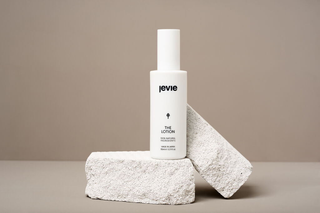
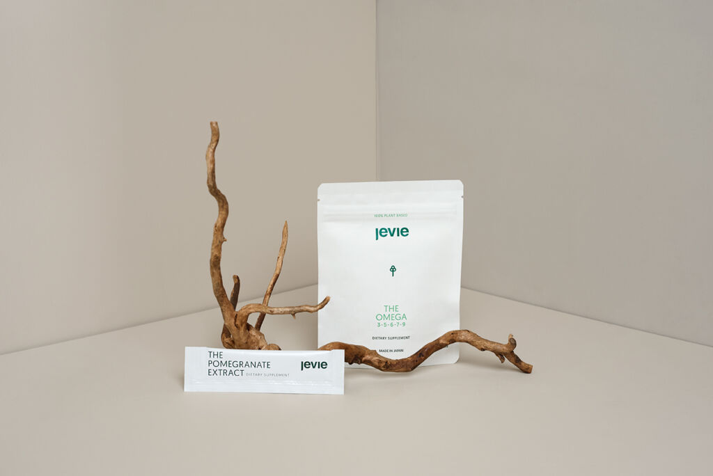
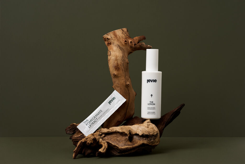
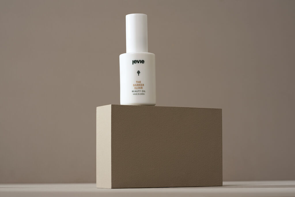
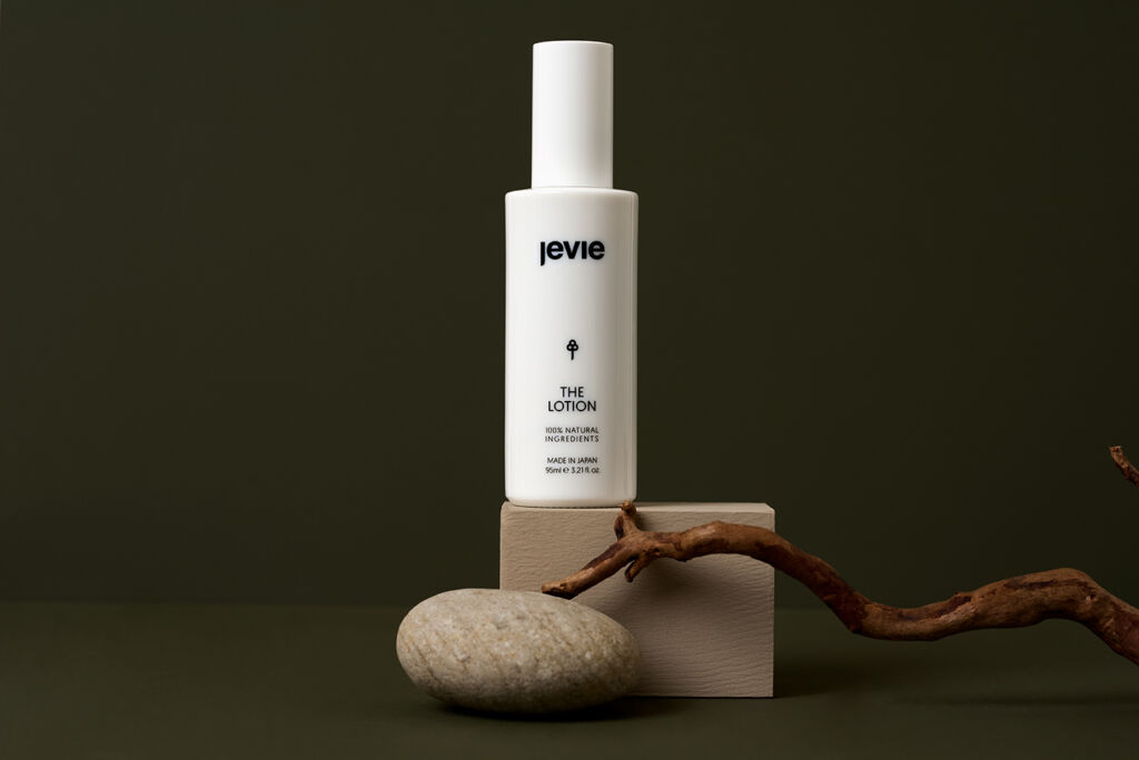
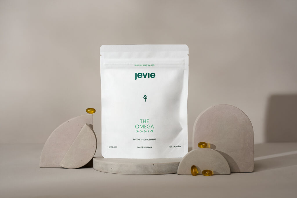
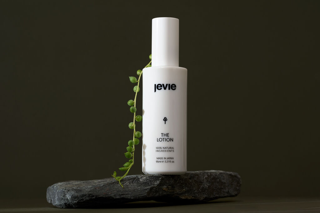
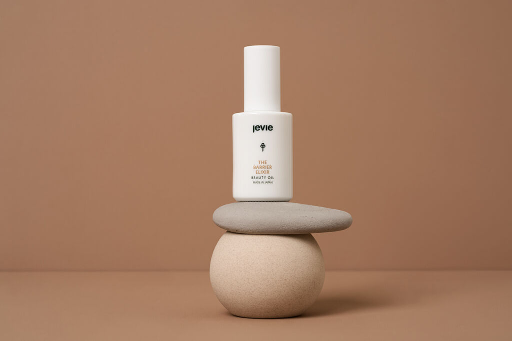
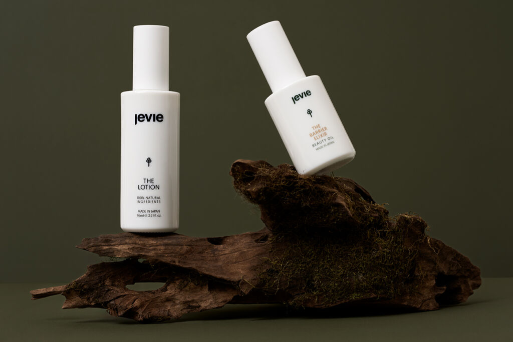
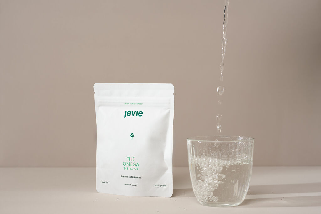
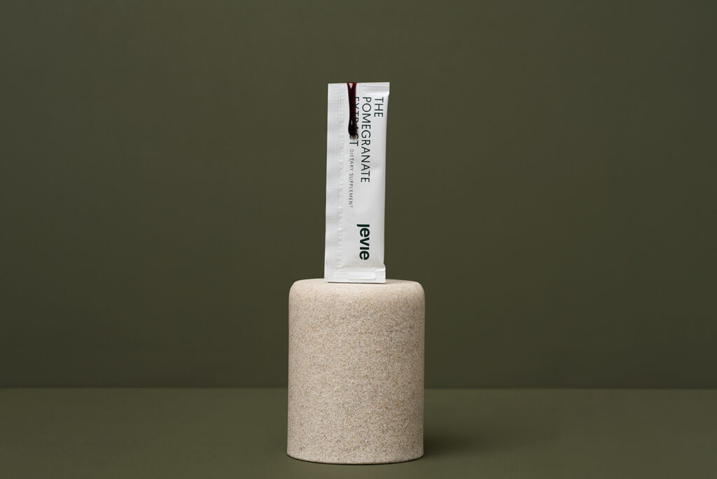
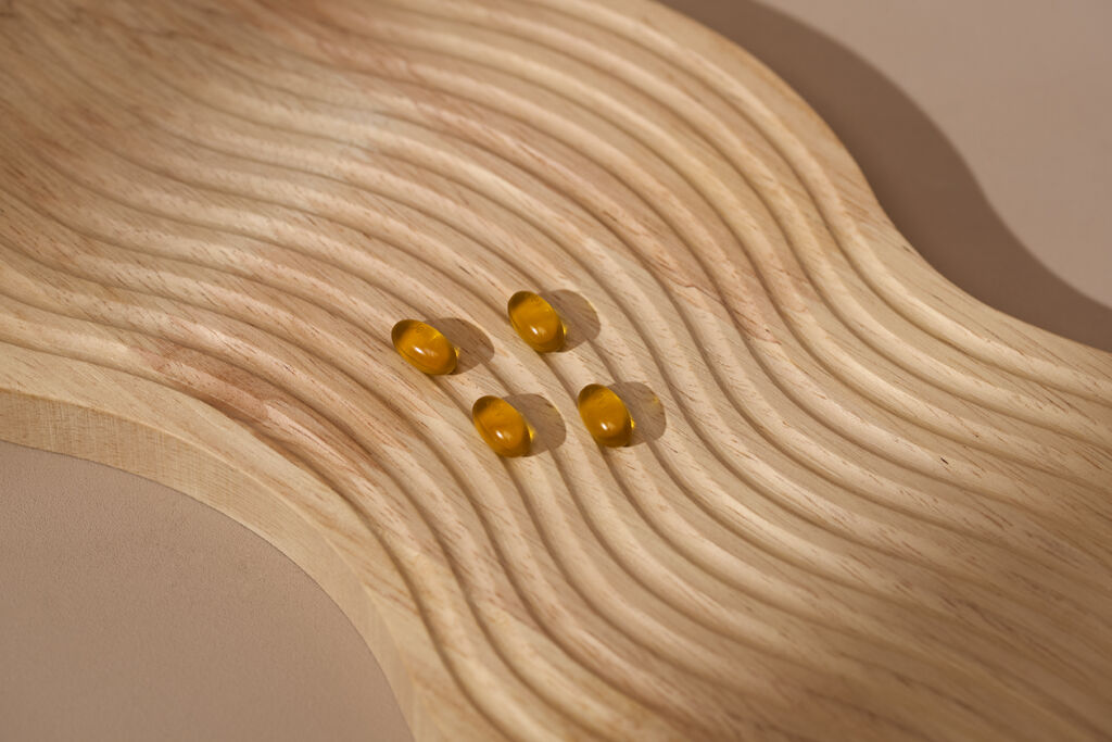
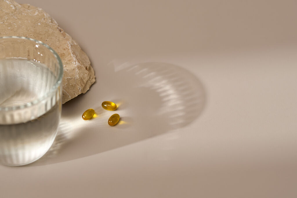
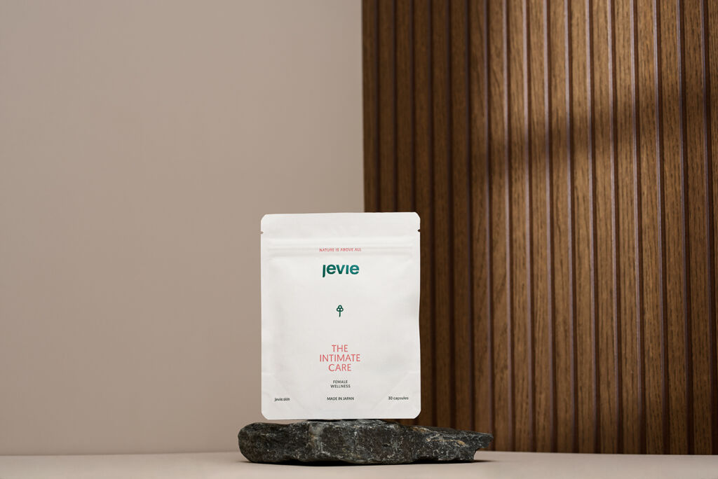
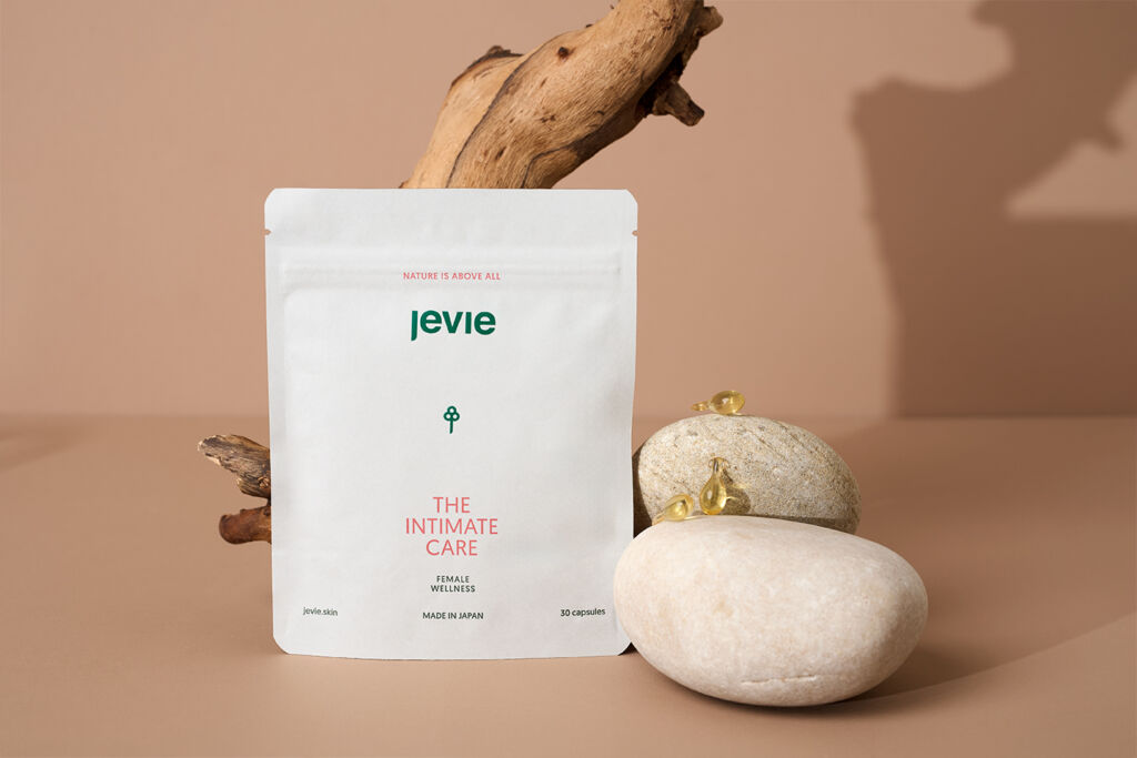
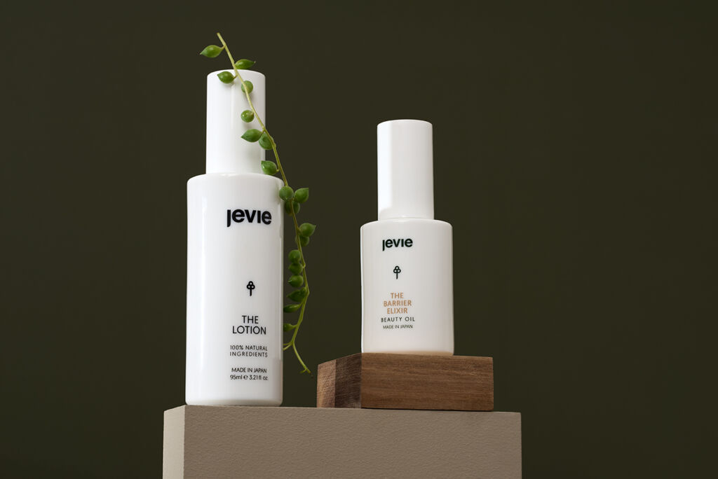
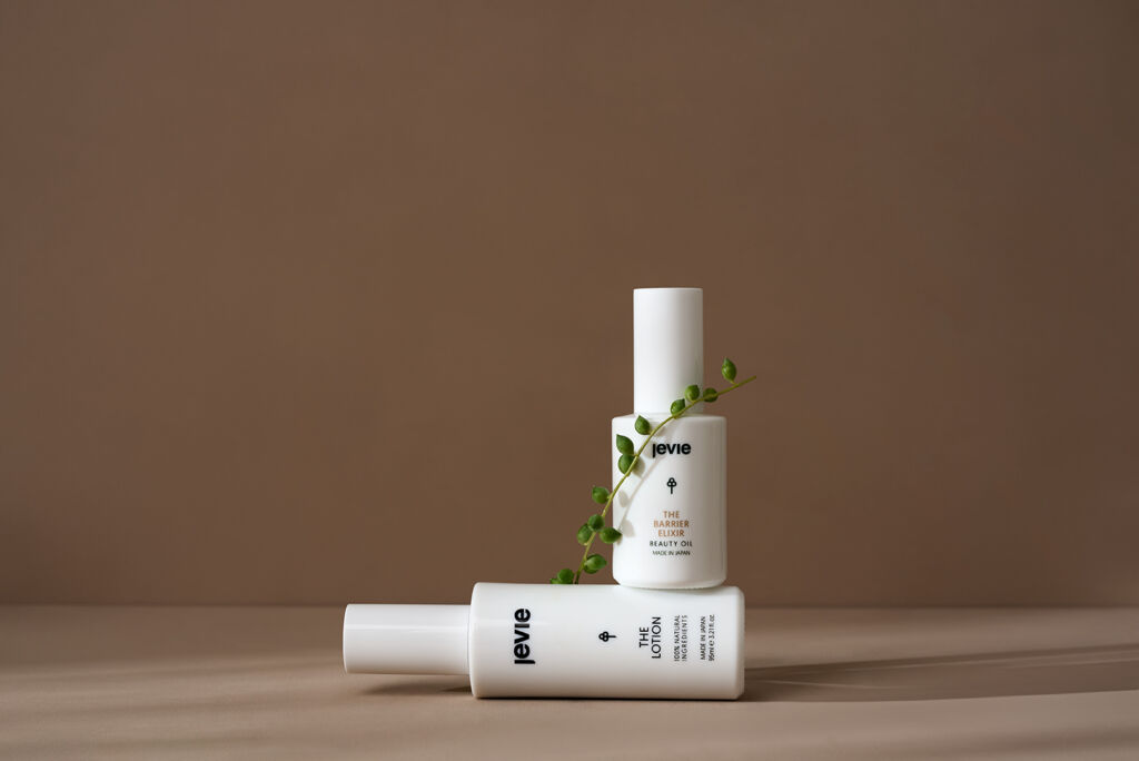
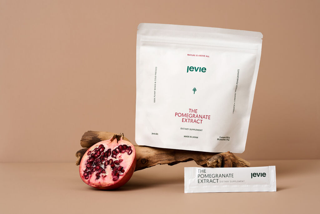
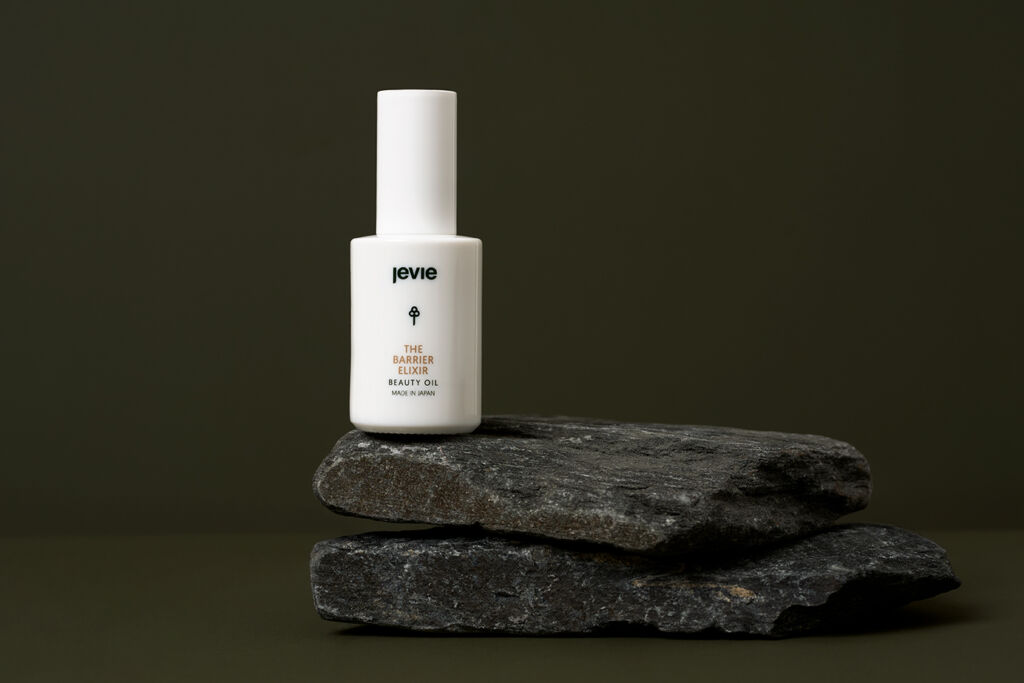
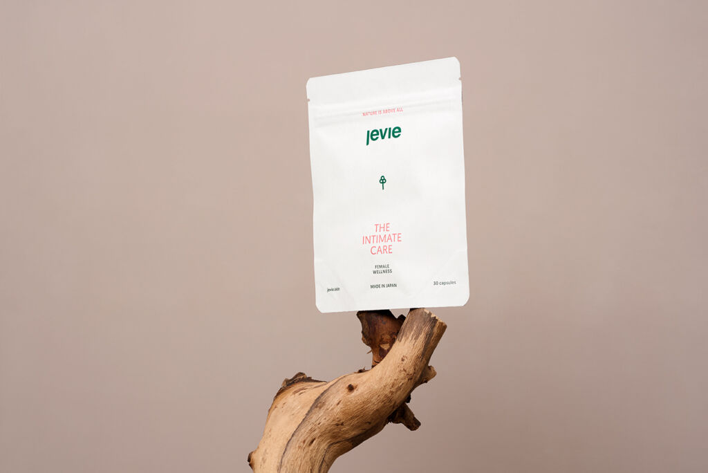
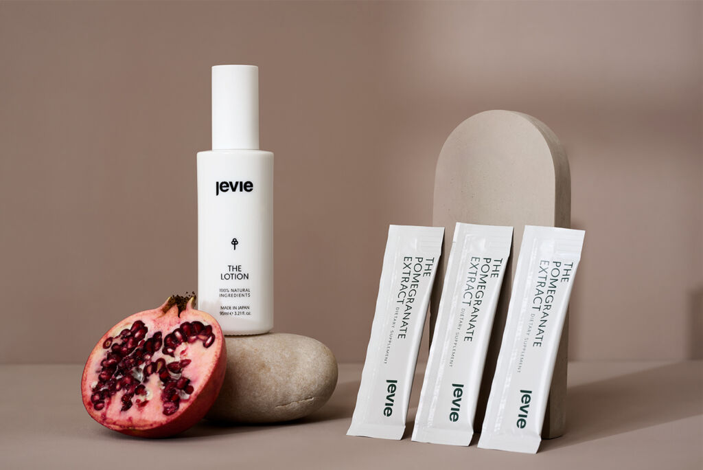
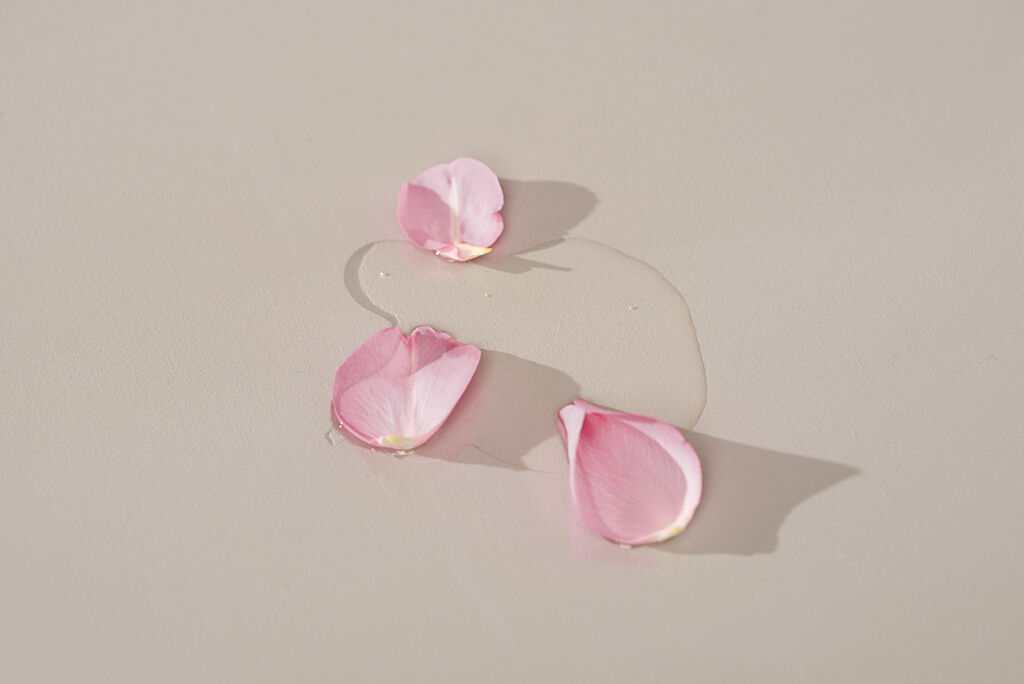
Jevie came with a moodboard that was mainly with elements from the Japandi and Scandinavion style.
Natural elements as their brand is natural based, with pure ingredients. So with a moodboard and vision in mind, I started concepting. I always make a shot list, with little drawings or ideas that match the products the best. As Jevie is a brand based in Sweden, I didn’t see the products in real-life before making the concepts, so this made it a little harder as you’re not sure if everything will work out. So some of the concepts I had in mind didn’t really work out the way I wished.

Moodboard with muted tones, showcasing products with natural elements next to them.

What to do if a concept doesn’t work out the way you intended?

As I didn’t see the product in advance, it was important to create a general idea for the concepts. But be a little flexible about this. I communicated this to the client. As an image doesn’t work out the way I intended, I make sure to add some variants. Especially if the client isn’t precented at the shoot, you want to make sure to give the client options while selecting the images. So for every product I tried to shoot one additional image, that the client maybe would like better. This doesn’t mean there won’t be any re-shoots or feedback. But it gives the client an extra option and let them feel that you care.

How to work with an abroad client.

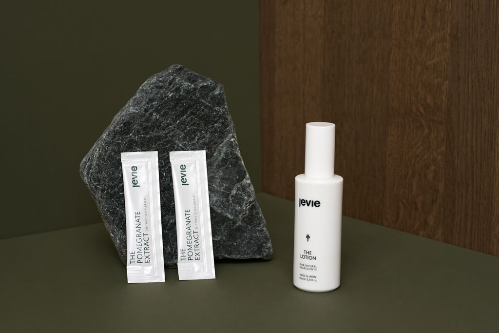
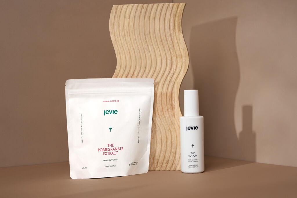
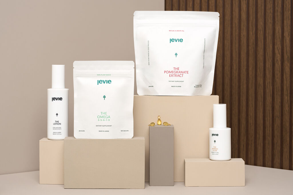
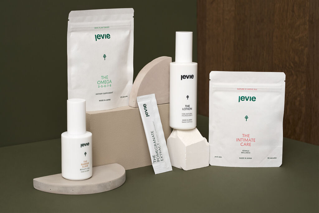
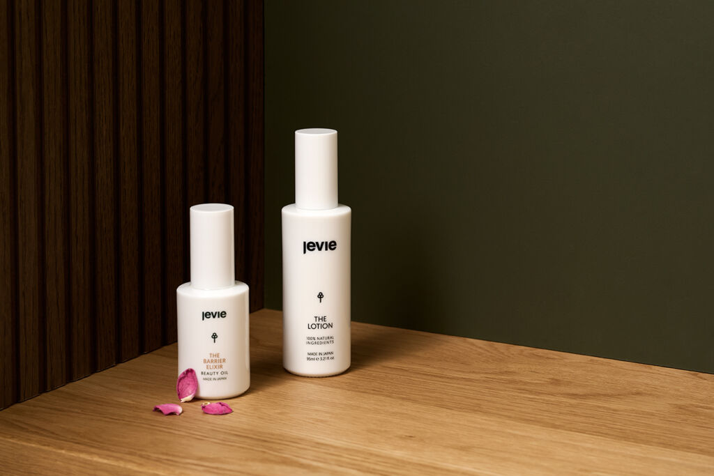
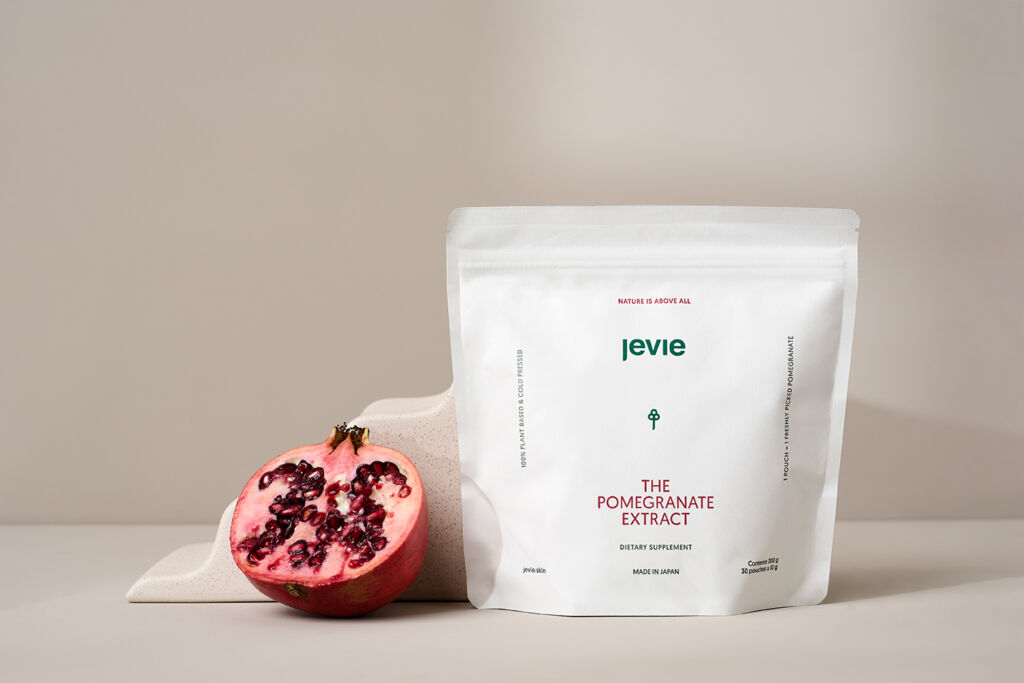
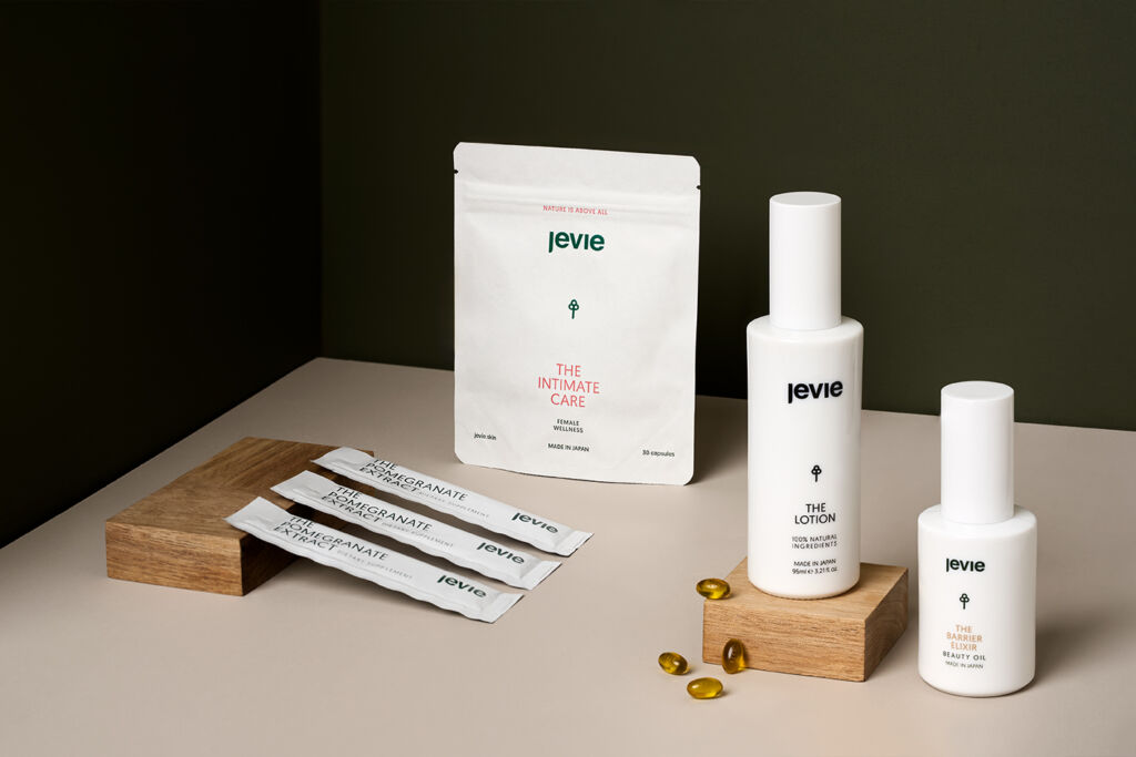
Jevie is a brand based in Sweden, but originally found in Japan. Therefore, it’s really important to have both the Scandinavian and Japandi woven into the product imagery. So that’s why it’s also really important to create the shot list I mentioned before. Because Jevie had quite some images, they wanted to be taken, but couldn’t be done all at one shoot day.
As the amount of images needed multiple shoot days, I uploaded the images after every shoot day on Picflow. By doing this, the client can already have a look at the images and can provide feedback, so you know what they like and what they don’t. This way I don’t keep shooting images that are not perfect for the client, and understand better what they like and what they don’t.

What kind of deliverables were they looking for?

  • Use muted & natural backgrounds.
  • Images need to be delivered in 16×9, 1×1 & 2×3 (Export them with a lot of space around, so they have the possibility to crop themselfs)

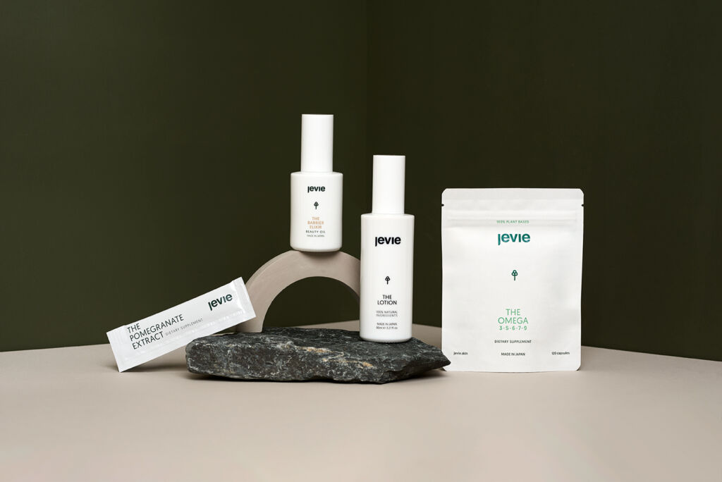
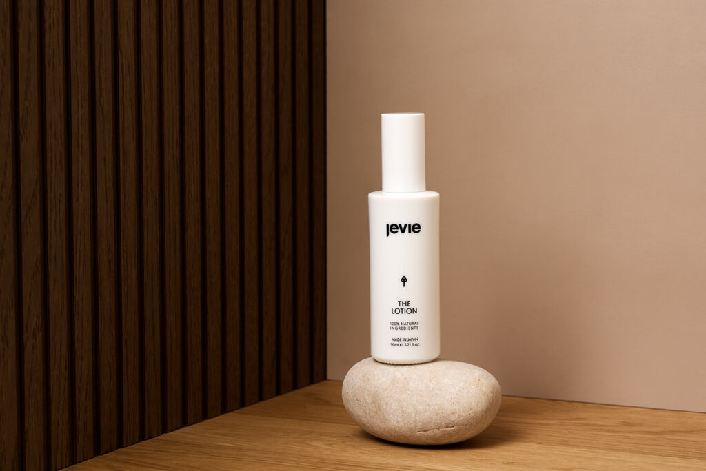
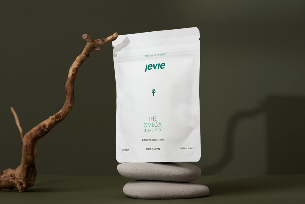
As a result, you can find the images below:

White glass lotion bottle on white broken stones. Placed on a beige background.
White products, placed in a corner with a wooden wall on the right, and a green wall as the floor and side. Two products are leaning against a black rock.
A promgranate leaning again small stairs which has a white pouch on it with The Pomegranate Extract in it. It's on a taupe background and on the right of the pomegranate is a stone arch.
4 White products placed in a cornered space with two green walls and a taupe floor. Two products are leaning on a rock and one stands on an arch.
Two walls with a corner behind the product, Behind a branch the Omega package is standing. In front of the branch a pouch from the Pomegranate Extract is standing.
Green background with an wooden bark standing on it. On the right side on top of the bark is The Lotion, which is a white package. On the left-hand side, there is the Pomegranate Extract leaning against the bark.
Swatch of the pomegranate extract. Dripping into a pound of product.
The Barrier Elixer. Placed on a taupe background, with lighting on the side which is lighting up the block the product is placed on.
The lotion in a white glass bottle on top of a square taupe block. In front of the block is a stone with a branch on it. The background is moss green.
A beige background with a swirl wooden board. With two with products called The pomegranate Extract and the Lotion in front of it.
All the products from Jevie placed on pedals. All the Pedals are beige/taupe but in different veracity. All the packages are white, and on one of the pedals there are pills showing. On the right side of the image there is a wooden Japandi like wall.
The set is build like a corner of a room. On the left wall it's green and on the right it's wood. It showcases 5 products from Jevie. On the left we start on a moon shaped beton prop the Barrier Elixer. Then there is a wooden rectangle which has the omega on top of it, with next to it a half-moon shapped beton prop, where from the ground is the pomegranate leaning against. Next to it there is a small beton prop where the lotion is standing on. And next to it on the floor there is the intimate care.
A taupe background with different taupe moonshaped elements. In the middle of the image is a white product package with The Omega on it. Surrounded by the moon shaped beton props where are leaning some pills from the packaging on.
The Lotion in a white bottle on top of a grey/black stone with a green pea branch leaning on the product, going down onto the stone. On a green background.
A warm copper background with a circle with a stone leaning onto it with the barrier elixer (a white glass bottle) on top.
A piece of wood with two white bottle balancing on top of it. On the left is The Lotion and on the right there is the barrier elixir.
Beige background with on the left the omega, slightly looking to the left with a glass of water next to it where currently water is being poured into.
Swatch from the barrier elixir.
The pomegranate extract pouch on top of a pedal. Dripping product out of it, going over the extract text.
4 Pills on a wooden wave board. The light is shining through the pills which gives a warm reflection onto the wood.
A glass with water where comes light through which gives a reflection on the pills that are lying right next to the water glass.
A cornered room, with 3 different textures. On the left is a wooden wall with slats. On the right is a green wall, and the bottom is oak wood. There are two white glass bottles standing on the left-hand side of the image. On the left bottle there are 3 rose pedals leaning onto it. Next to it is the lotion standing.
On the left side is a wooden wall with slats. On the right is a beige wall and on the bottom a oak wooden floor. On the floor is a white/beige stone with a white bottle on top of it.
Green background, the packaging is white and standing on two grey rocks. Onto the packaging is a bark leaning, which creates a small shadow onto the product.
On the left is a taupe wall, on the right a wooden slats wall with a sunbeam from a widow onto it. In the middle of the image is a black rock with a white packaging from The Intimate care on it.
A copper background with a wooden branch where the intimate care is standing in front of. Next to the product are two stones with some pills on them which are the pills that are inside the package of The Intimate Care.
Green background with a rectangle block in a taupe colour. On the left is  a white glass bottle with a pea plant hanging on it. On the right is a smaller white glass bottle standing on top of a small wooden block.
Two white glass bottles, one is on the side while the other is leaning on top with a pea plant hanging onto it. Creating a shadow over the logo.
A copper background with a bark with the pomegranate extract bag on it. Next to it is a fresh cut in half pomegranate and in front is a small pouch from the package.
A green background with two grey stones where a white glass bottle from the barrier ellixir is placed onto.
A taupe background, but a wooden bark is shown with The intimate care balancing on top of it.
A taupe background. On the left is a fresh cut in half pomegranate, leaning against a beige stone where The Lotion is standing on. Right from the lotion is a arch with 3 white packages from The Pomegranate Extract. In the background, you can see a small light leak from a window.
A swatch from the Barrier Elixir surrounded by rose pedals, as that is a main ingredient.
Beige stairs with a pomegranate leaning onto it. Right from the freshly cut pomegranate is a bag with The pomegranate extract pouches. The pomegranate creates a small shadow, as there has been used semi-hard lighting.
A cornered scene with both dark green walls, slightly from above with a beige background. All the products are shown. On the left is a wooden plateau where the pomegranate extract leans onto. Behind it is the intimate care and in the foreground there is a small wooden plateau where the lotion is standing on, but also some pills are leaning onto. Right from that plateau is the barrier elixir.

Team:

Production Manager: Tom Paape | Studio Taupe
Photography & Retouch: Jasmijn Bult | Studio Taupe

Want to book us for your next creative shoot? Contact us here.
Are you already following me on Instagram?

Leave a comment